Start with a quiet base
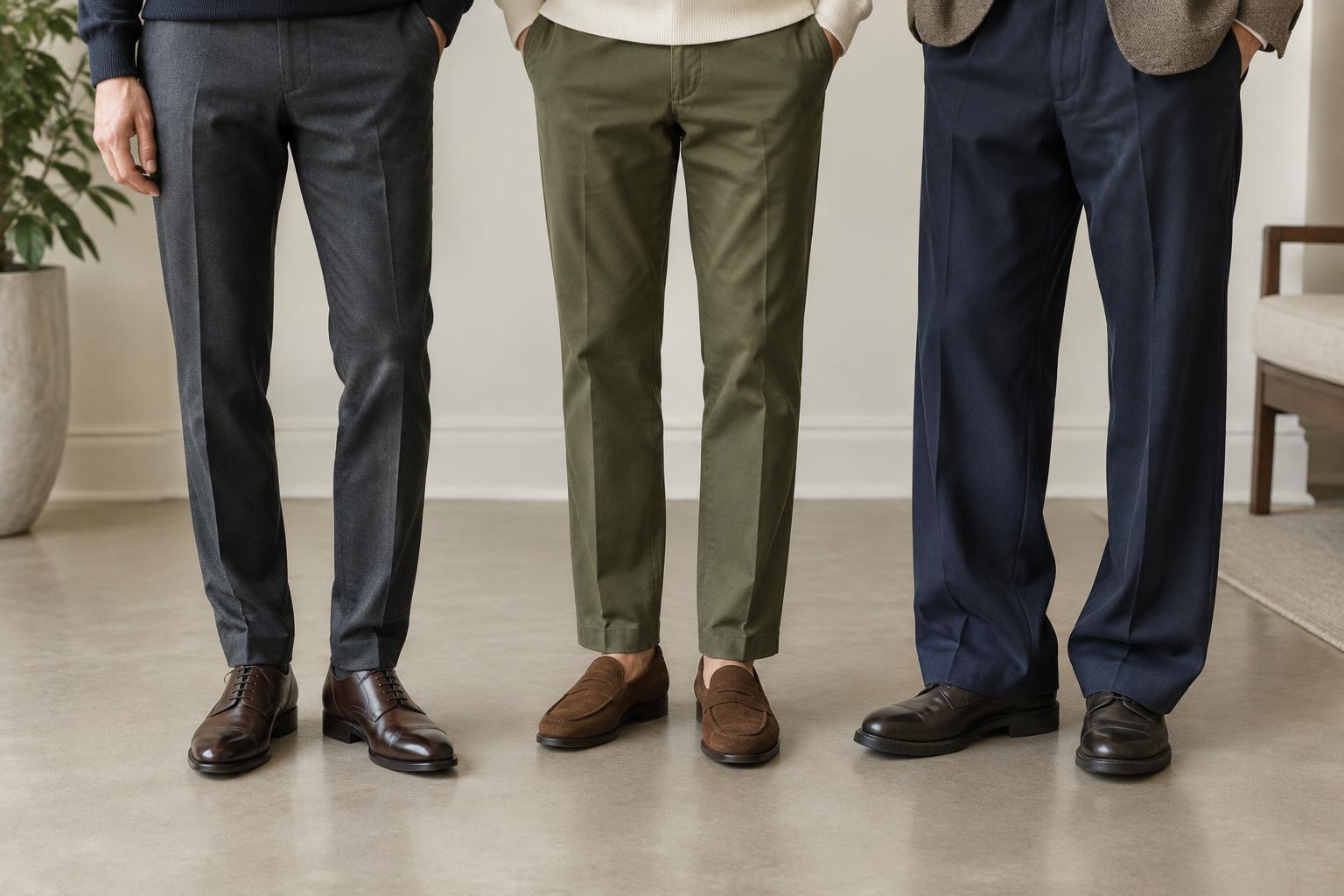
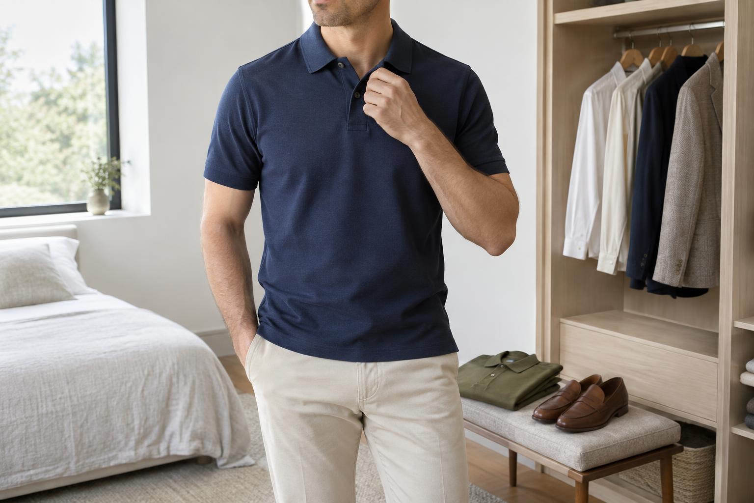
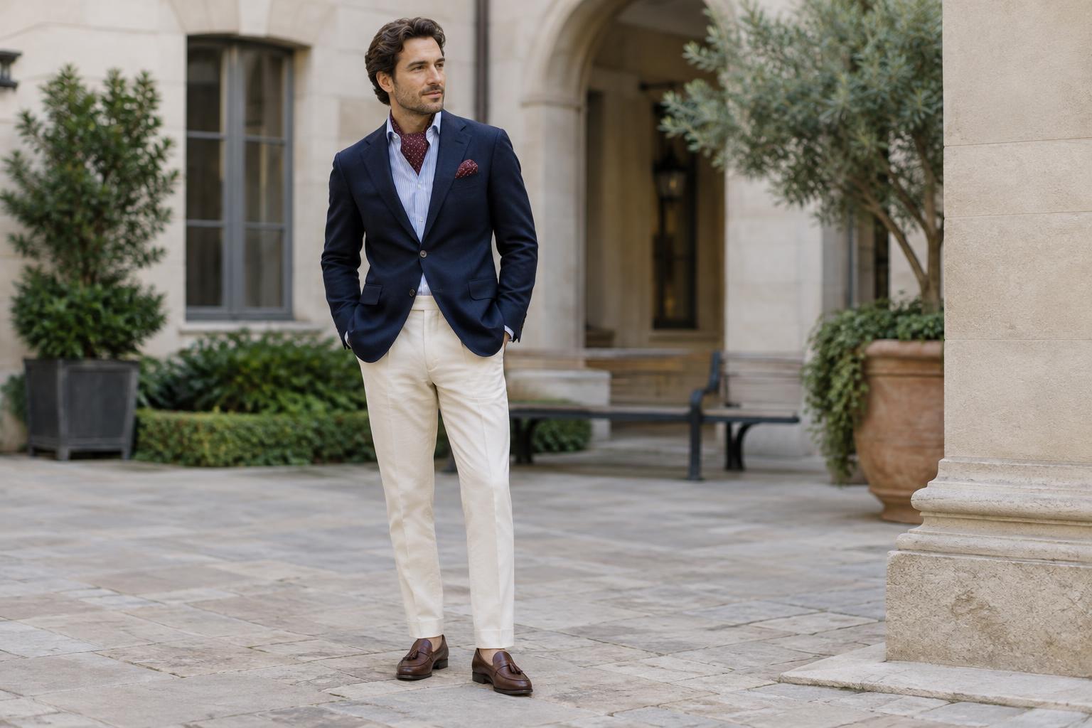
A reliable way to build an outfit is to choose its least demanding pieces first. Navy, charcoal, brown, olive, cream and denim can provide a calm background for a brighter color or a noticeable print. They are not the only options, but they make it easier to see which item is doing the visual work. For example, dark jeans and a navy jacket leave room for a patterned shirt; cream trousers and a white shirt can support a richly colored overshirt.
Think about how much of each color you can see. A vivid pocket square occupies little space, while a vivid coat dominates the outfit. If you want to try an unfamiliar shade, a smaller item is an easy starting point. If the bold piece is a jacket or pair of trousers, keep more of the remaining outfit subdued. The goal is not to avoid color, but to give the eye a place to rest.
Choose one focal point, then connect the colors
Before adding a second interesting item, decide what you want someone to notice first. It might be a rust sweater, a checked blazer or a striped shirt. Other pieces can have character, but they should not all compete at the same volume. A patterned blazer, for instance, is easier to wear over a plain knit than over another large, high-contrast print.
Look for a color you can repeat rather than trying to match everything exactly. If a checked jacket contains a muted blue line, a blue shirt can make the combination feel deliberate. A tie might pick up a small amount of burgundy from a shirt stripe without being the identical shade. Repetition works best when it looks like a connection, not a uniform: varying the depth of a color can add interest while keeping the outfit coherent.
Consider the overall warmth of the colors, too. Warm shades such as tan and rust often sit comfortably together, as do cooler shades such as slate blue and charcoal. Mixing warm and cool colors can also work; a neutral layer between them helps create a transition.
Mix patterns by changing their scale
Two patterns are usually easier to combine when they differ in size. A narrow-striped shirt can sit under a jacket with a broad windowpane check because the shapes read separately. Two bold checks of similar size are more likely to blur together. The same principle applies to accessories: a small dotted tie can add texture next to a wider shirt stripe without repeating its rhythm.
Contrast matters as much as scale. A fine pattern in low-contrast colors can behave almost like a solid from a distance. A sharp black-and-white print will draw attention even if its shapes are small. When combining patterns, try making one clearer and the other quieter. Keep a solid piece nearby, such as plain trousers or a simple jacket, so the patterned items have some breathing room.
You do not need to mix prints to make an outfit interesting. Denim, ribbed knitwear, suede and textured wool offer visual variety without adding another motif. If two patterns feel like too much, replace one with texture and see whether the outfit feels more balanced.
Let the occasion set the volume
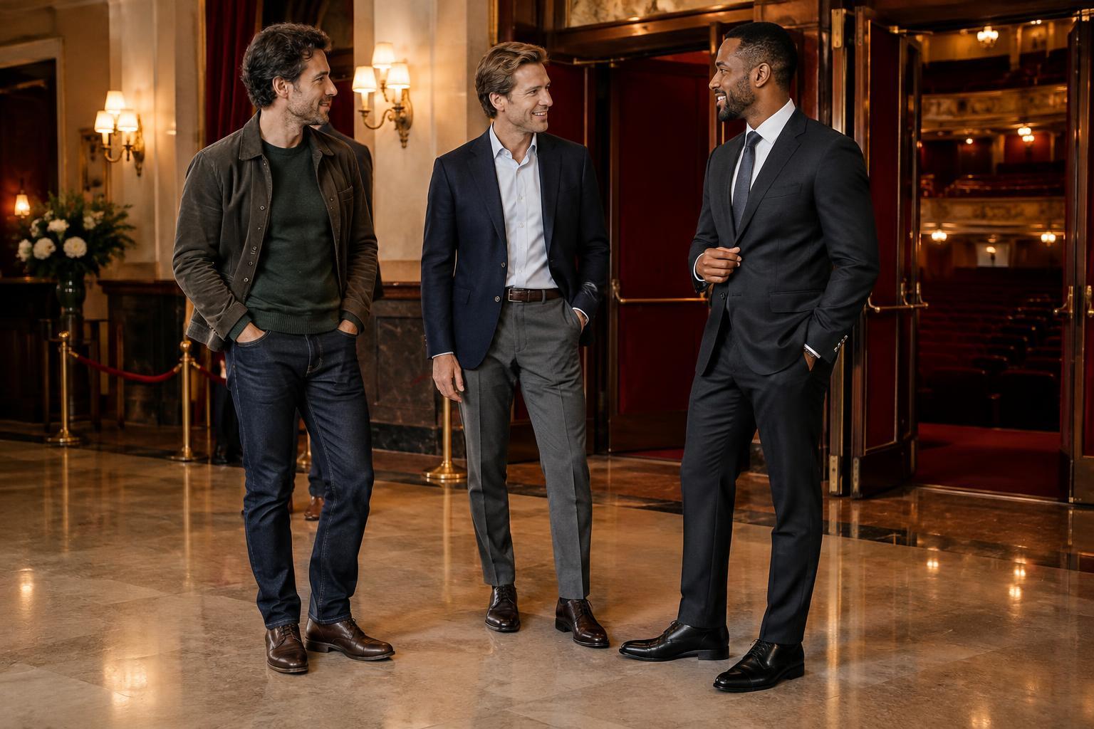
The same color combination can feel restrained or expressive depending on its placement. For a conventional workplace, try a navy suit, pale blue shirt and a tie with a modest pattern. The shirt and suit establish a familiar base, while the tie supplies detail. In a more relaxed office, a fine-striped shirt with plain chinos and a solid cardigan offers pattern without making it the center of attention.
Weekends allow more room for a bold item. An olive overshirt, cream T-shirt and dark jeans make a straightforward base for patterned socks or a scarf. Alternatively, let a patterned camp-collar shirt lead and keep the shorts, shoes and belt simple. For a social occasion, a checked jacket can look considered with solid trousers and a shirt in one of the jacket’s quieter colors. Treat these as starting points rather than dress codes; the setting and your comfort should guide the final choice.
Check the whole outfit, not just the pieces
Lay garments together or try them on before deciding that a pairing works. Step back from the mirror: details that seem subtle up close may combine into a busy impression at a normal viewing distance. Check whether one item stands out clearly, whether the colors connect, and whether any two patterns are fighting for attention. If something feels off, changing one piece is usually more useful than rebuilding the entire outfit.
Fit and condition also affect how colors and patterns read. A well-fitting patterned shirt can look purposeful, while bunching fabric may make the same print appear more crowded. Faded darks, worn shoes or a creased jacket can distract from an otherwise good combination. Once the outfit feels balanced, stop adjusting it. Color and pattern work best when they support what you are wearing, rather than turning every item into a separate statement.